i-Movie
We used i-Movie as our main editing program for our soap opera. Compared to Adobe Premier, which we used a lot last year, this program was far more advanced and I was ab le to make our trailer look more professional because of this. I found that it was easier to upload the footage we had directly from the camera onto the Mac and then to arrange it in a storyboard. When it came to finding the right extra diegetic music and sound effects, this program benefited us hugely; the program itself had a wide selection of copyright free music and sound effects that we could use, making the time it took for production smaller than in previous products, because before we had to spend a long time trying to find these sounds. I was able to adjust the sound levels on the video files with this program, which I used to make the sound of Helen's footsteps louder at points of the trailer I wanted to enhance with this. Although the program did have sound effects on it, we did record several of our own, including the sound of Stephanie slapping Richard, which we did using the built-in microphone on the mac.
 le to make our trailer look more professional because of this. I found that it was easier to upload the footage we had directly from the camera onto the Mac and then to arrange it in a storyboard. When it came to finding the right extra diegetic music and sound effects, this program benefited us hugely; the program itself had a wide selection of copyright free music and sound effects that we could use, making the time it took for production smaller than in previous products, because before we had to spend a long time trying to find these sounds. I was able to adjust the sound levels on the video files with this program, which I used to make the sound of Helen's footsteps louder at points of the trailer I wanted to enhance with this. Although the program did have sound effects on it, we did record several of our own, including the sound of Stephanie slapping Richard, which we did using the built-in microphone on the mac.
 Cameras
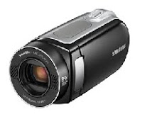
We filmed every part of our trailer using four different Samsung cameras, which we set up in various po sitions and angles. I think that these cameras were good to use because they picked up every bit of sound made; we filmed Helen walking down the road and the camera picked up the sound of her footsteps which became a recurring theme throughout the trailer, and one of the main aspects we wanted to focus on. We could watch footage back on the camera and so could check we had the shots we needed whilst still on location, which mostly eliminated the risk of realising during the diting process that we didn't have all the footage we needed. The only downside to these camera was that they didnt have a very long battery life but we just made sure that we charged them after every use, and because of this the battery life didnt really become a major issue.
 sitions and angles. I think that these cameras were good to use because they picked up every bit of sound made; we filmed Helen walking down the road and the camera picked up the sound of her footsteps which became a recurring theme throughout the trailer, and one of the main aspects we wanted to focus on. We could watch footage back on the camera and so could check we had the shots we needed whilst still on location, which mostly eliminated the risk of realising during the diting process that we didn't have all the footage we needed. The only downside to these camera was that they didnt have a very long battery life but we just made sure that we charged them after every use, and because of this the battery life didnt really become a major issue.
 Tripods
We used four tripods throughout filming to keep the cameras as steady as possible, and to get as many variations of a shot as possible. This worked out well for us because it provided us with a larger choice of footage when it came to editing and so we could make the trailer more interesting and get it to the highest quality possible. We put the tripods at varying heights as well so that we could film from several different angles, for example at the end of the trailer we shot from a low angle which made the cast members look important, and connoted that they would be integral to the soap opera.
Computer programs
We used several different computer programs whilst completing this project also. Microsoft Word, Excell and Paint were those which I personally made use of, and they benefited me throughout the project. I used Excell to create shot lists and filming schedules, because it helped me to put all the information I needed into one place and then create tables displaying this. I used Microsoft word throughout for various written pices. I also used this for my magazine cover analysis because I placed the imagine in the middle and then used text boxes around it to analyse the colours, fonts and images used. I found that it was helpful also in creating my magazine cover because I could use various shapes when making the masthead and I used word art for the titles and tag lines.


